Home » Benefits Buddy – branding
case study:
Benefits Buddy - branding.
client.
project type.
sector.
budget.
location.
project overview.
Benefits Buddy is a new employee benefits platform born out of HWWA Consulting, a UK-based consultancy founded by William Annison in 2011. The platform needed a complete brand identity from scratch, one that could stand apart from HWWA while carrying forward the same commitment to personal service and genuine care.
After years of watching employees struggle to understand their benefits and employers struggle to communicate them, the team set out to build a simple digital tool that would bring clarity to a confusing industry. tinybox creative was brought in at the pre-launch stage to lead the brand strategy and visual identity process, working with the founding team of William, Laura and Marietta to shape the brand from the inside out.
The challenge was to create a brand that felt warm, approachable and human in a market dominated by large SaaS platforms, while still communicating the professionalism and compliance expertise that sets the team apart.
the brand canvas.
The project began with the tinybox brand canvas, a structured deep-dive session designed to uncover the strategic foundations of the brand before any visual work begins.
During the workshop, the team explored their origin story, identifying how William’s desire to maintain client relationships and deliver a higher standard of service led him to establish HWWA, and eventually to the idea for Benefits Buddy. The repeated gap they kept seeing, employees who didn’t understand their benefits and employers who couldn’t communicate them, became the driving purpose behind the platform.
The workshop moved through a full SWOT analysis, competitor review and brand touchpoint audit, before arriving at the core brand-building exercises. The team identified the emotions they wanted Benefits Buddy to evoke: confident, reassured, looked after, relieved, and warm and welcomed. From there, the mission, vision, values and value proposition were crafted collaboratively.
mission.
“Our mission is to empower organisations and their teams to feel supported through clear benefits guidance and accessible digital tools, making employee benefits a delight, and not a burden.”
vision.
“The go-to employee benefits platform that empowers every employee in the UK to make the most of their benefits, setting the new standard.”
values.
1. Service Excellence, 2. Clear Communication, 3. Client-Centred, 4. Integrity, 5. Innovation
value proposition.
“We help organisations and their employees who need clarity in their employee benefits management using our simple digital platform that supports and empowers staff with a human touch.”
creative concepts.
With the brand strategy established, the next step was to bring it to life visually.
We developed three creative concepts for the team, each taking a different angle on how Benefits Buddy could look, sound and feel in the market.
Each concept was built out with its own rationale, colour palette, headline system and campaign mockups to show how the brand would translate across real-world applications. The three directions were then presented to the team for discussion and feedback.
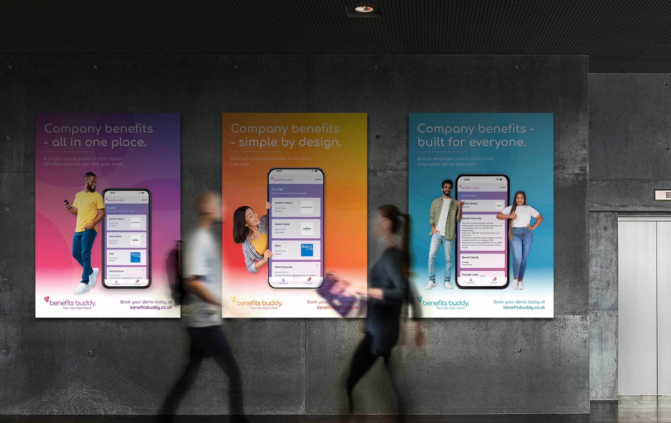
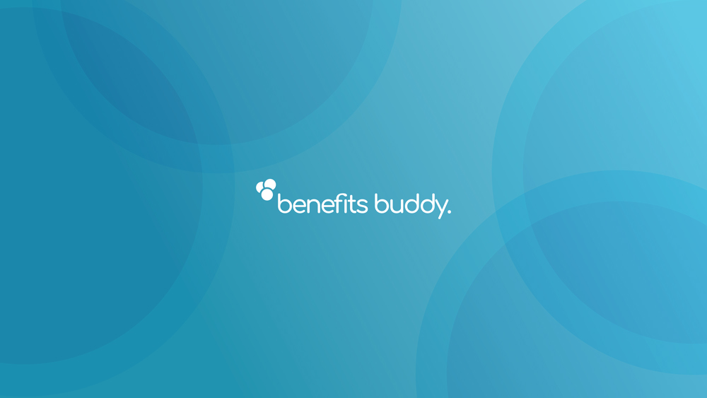
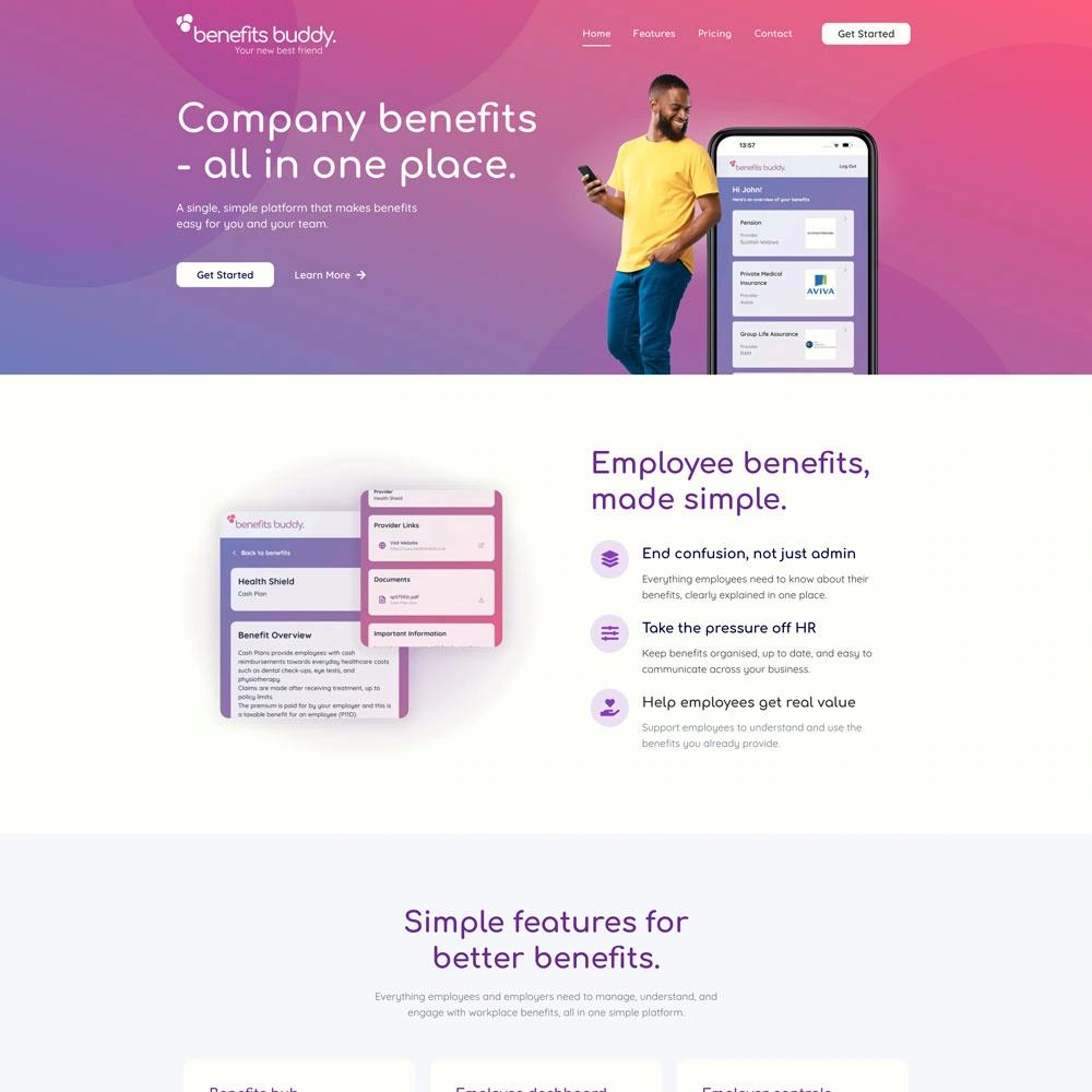
Concept A, A Friend for Life, leaned into companionship with abstract footstep shapes, a blue, yellow and pink palette, and lifestyle imagery of real people alongside app screens. Concept B, Your New Best Friend, centred on simplicity through rounded lowercase typography, three overlapping circles in the logo mark representing employees, employers and company benefits, and warm modern gradients. Concept C, Benefits Harmony, offered a more understated, editorial feel with a classic serif typeface and soft overlapping forms conveying calm and integration.


concept b.
The chosen direction did not come from one concept alone. It was shaped by elements from two.
The team responded strongly to the people-led imagery in Concept A, where friendly, relatable figures were shown alongside large-scale app screens, bringing the platform to life and making the brand feel human. But it was Concept B’s visual style that felt right, its rounded typography, overlapping logo mark and warm gradient palette capturing the simplicity and approachability they were looking for.
That theme of simplicity runs deeper than aesthetics. The team have spent years watching employees struggle with benefits that are poorly explained and difficult to access. Their experience and passion for service excellence shaped a clear conviction: that company benefits should be easy to understand, easy to manage and easy to use. Concept B gave that conviction a visual language.
We merged the two directions, carrying Concept B’s identity forward while bringing in Concept A’s people and device mockups. The final brand pairs bold gradient posters with real people interacting with the platform, unified by the tagline “Your new best friend” and three campaign headlines: “Company benefits, all in one place,” “Company benefits, simple by design” and “Company benefits, built for everyone.”
a message crafted for connection.
We developed a messaging strategy rooted in the core theme of Concept B: simple and easy benefits. Each headline was crafted to address the real frustrations employers and employees face, with Benefits Buddy positioned as the clear, friendly voice that removes complexity and makes benefits feel straightforward for everyone.
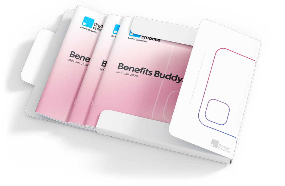
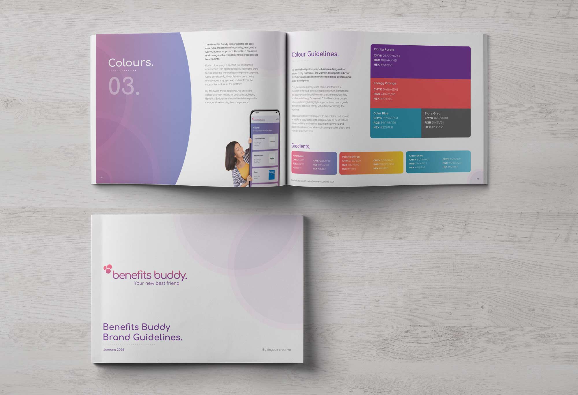
brand guidelines and assets.
Following the creative phase, a comprehensive brand guidelines document was produced to ensure consistency as Benefits Buddy moved toward launch.
The guidelines codified the brand voice, professional and friendly, giving the team a clear framework for how the platform should sound across every touchpoint. The document also established the visual rules: logo usage, colour palette, typography, imagery style and the overall design language that would carry through the platform and all marketing materials.
Alongside the guidelines, a full suite of branded assets was produced including business cards, letterheads, compliment slips and social media banners, giving the team everything they needed to present a polished, consistent brand from day one.
client testimonial.
“tinybox creative conducted a factfind to understand what we were trying to achieve. They helped us to work through the process of articulating our goals and values to be used in the branding for Benefits Buddy. This resulted in us being provided with a choice of branding options, a detailed branding guidelines document, including logos, social media banners etc. I have been really pleased with the results of the work and highly recommend their services.”
William Annison
Director, Benefits Buddy
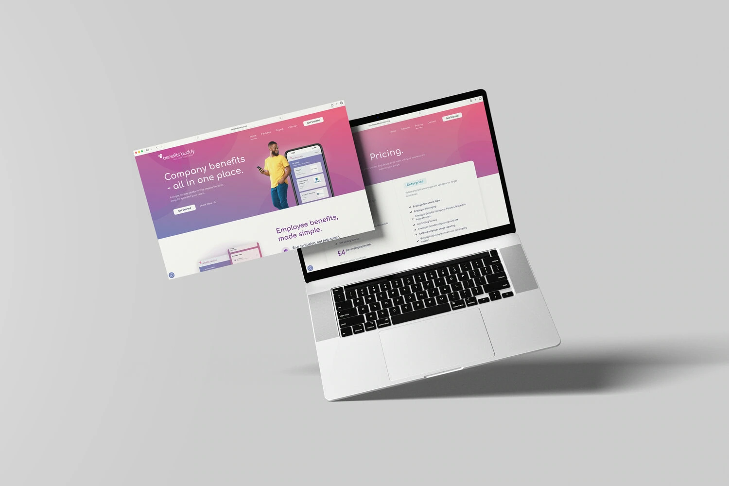
taking the new brand online.
With the brand established, Benefits Buddy needed a credible online presence to launch with. tinybox creative built out a microsite that carried the new identity into the real world, giving the business a professional platform to begin attracting clients from day one.
see more brand projects.


book your free consultation today.
or use our contact form to get in touch today