case study:

EverFit - branding.

client.

EverFit Logo Blue
EverFit

project type.

Branding

sector.

Health/Fitness

budget.

£1.5-8k

location.

Bath, UK

project overview.

EverFit approached tinybox creative with a bold ambition, requiring brand to match it. Founded by Ian Willis after a decade in the home care sector, EverFit set out to flip the script on later life healthcare, moving from reactive care to preventative, proactive support.

The team had a powerful story and a holistic programme spanning physical strength, nutrition, and cognitive health. What they lacked was a brand identity capable of unifying four very different audiences, older adults, practitioners, trainers, and home care companies, under one visual and verbal system that felt authentic and warm without diluting the message for any single group.

the brand canvas.

The tinybox Brand Canvas workshop took the EverFit team on a deep exploration of their internal and external landscape, from origin story and competitor analysis through to buyer personas and brand voice.

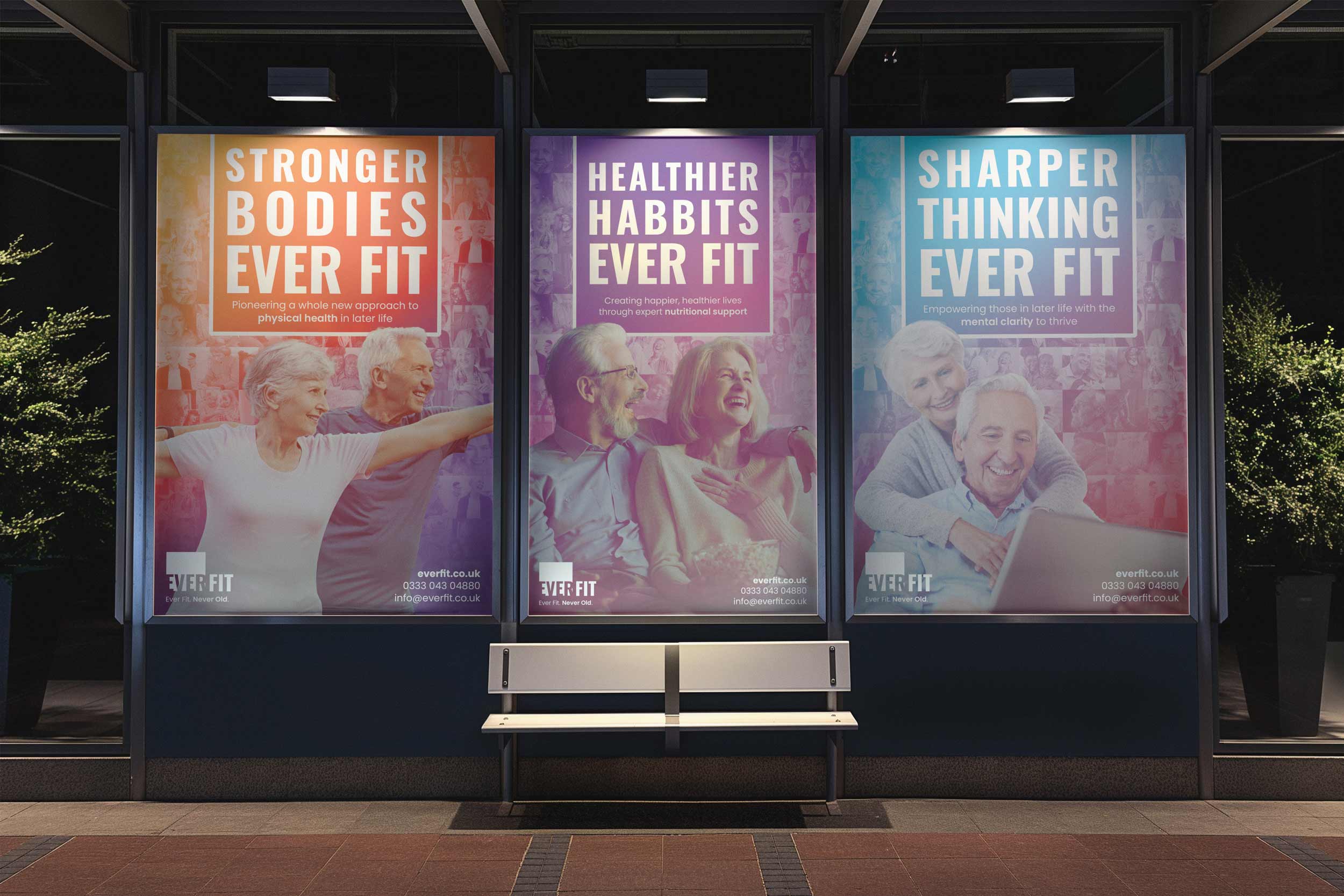
What became clear early on was that EverFit’s real differentiator sits in its philosophy. Where most care services step in after health has declined, EverFit intervenes before that point, helping people build strength, mobility, and resilience so they can delay or even avoid the need for care altogether. This preventative approach, largely absent from the current later life care landscape, gave the brand a genuinely distinctive story to tell.

The workshop also surfaced critical emotional territory. Words like “supported,” “hopeful,” “trusted,” and “genuine” came up repeatedly. The team wanted people to feel that someone had their back, that later life did not have to mean decline. There was a clear desire to avoid anything clinical, patronising, or overly corporate, and the brand voice landed on three pillars: empathetic and supportive, inspiring and motivational, friendly and conversational.

EverFit Logo White
EverFit Brand Canvas report in a folder

mission.

“Our mission is to empower people to be happier, healthier and stronger in later life through tailored physical, nutritional and cognitive support to stay fit for life.”

vision.

“The most trusted healthy ageing community, empowering 1 million+ people to be happier, healthier and stronger in later life.”

values.

1. Do the right thing, 2. Do the best job you can, 3. Show you care, 4. Reflect, learn and grow

value proposition.

“We Empower older individuals to maintain independence and wellbeing in later life using our innovative EverFit support programmes that promote mobility, nutrition and cognitive function, equipping them with control over their future health.”

creative concepts.

Three distinct brand directions were presented, each presenting EverFit’s positioning from a different creative angle. All three shared a common thread: reframing later life as something to embrace rather than endure.

Concept A: Fit for Life leaned into the word “Ever” within the company name, exploring themes of permanence and empowerment. A circular graphic device built from images of people in later life served as the core visual motif, with headlines pairing “Ever” with uplifting adjectives.

Concept B: Believe in a Better Later Life… centred on the theme of “better.” Emotive photography of older adults formed the backbone, with serif typography giving a respectful nod to tradition while graphic overlays introduced contemporary energy.

Concept C: Transforming Later Life was the wildcard. It pushed beyond the softer tones of the other two directions into something altogether bolder, using movement-based branding and grids of square-tiled imagery showing many different older people living happy, active lives. Dynamic colour gradients were layered across these grids, and the headlines were punchy and unapologetic: “Stronger Longer Together,” “Breaking Barriers Together,” “Join the Movement.”

Three EverFit billboard posters showing the branding in-situ
EverFit Logos in Purple
EverFit Logos in Teal

concept c.

The team gravitated immediately towards the wildcard. Concept C presented a vision of the brand they hadn’t previously considered, and once they saw it, the direction felt obvious. The movement-based positioning was a natural fit for a brand that wants to rally all four audience streams around a shared cause.

The EVER FIT wordmark sits in bold uppercase type, with the tagline “Transforming Later Life” beneath it and a secondary line, “Ever Fit. Never Old.”, capturing the defiant spirit of the brand in just four words. The visual identity revolves around people, with grids of square-tiled portrait photography forming a signature backdrop across every touchpoint. Bold gradient colour washes, shifting from warm amber to vivid magenta or teal to soft purple, overlay these grids with a vibrancy that shatters the muted palettes typically associated with later life brands.

Campaign headlines operate across three pillars tied to EverFit’s core programme areas: “Stronger Bodies, Ever Fit” for physical health, “Healthier Habits, Ever Fit” for nutrition, and “Sharper Thinking, Ever Fit” for cognitive wellbeing.

EverFit tiled imagery of people in later life with a coloured overlay

a message crafted for connection.

We developed a messaging framework that works across all four of EverFit’s audience streams while keeping a consistent emotional register. Each headline maps to one of the three pillars of the EverFit programme: physical strength, nutritional support, and cognitive health.

STRONGER BODIES - EVER FIT
HEALTHIER HABBITS - EVER FIT
SHARPER THINKING - EVER FIT

client testimonial.

“Mike has been brilliant to work with, shaping the brand message and creatives for EverFit Health, a start-up in the age care/fitness sector. He demonstrates passion for his work, and aligns his own values with who he works with; his workshops are hands on and he is driven to deliver a high quality and practical output that will support a business as they grow and scale.”

Lisa Bunclark

Operations Director, EverFit

see more brand projects.

Tom Campbell Wealth Management – branding

Benefits Buddy – website development

Benefits Buddy – branding

book your free consultation today.

When a business lacks clarity in how it presents itself, trust erodes and differentiation disappears. Prospective clients hesitate, delay decisions, or default to comparing on price. Book a complimentary 30-minute consultation to gain clear, practical insight into where your positioning and messaging stand today.

or use our contact form to get in touch today

First name *
Last name *
Email address *
Phone number *
How did you hear about us? *
Message *

Front cover of website clarity guide

download the free website clarity guide.

Everything you need to close the gap between the quality of your work and the strength of your online presence.

By downloading this guide, you consent to being contacted by tinybox creative. You can unsubscribe at any time.

search this website.