Home » Watch Elm Consulting – branding
case study:
Watch Elm Consulting - branding.
client.
project type.
sector.
budget.
location.
project overview.
Watch Elm Consulting is a technical training and consultancy business founded by Nick Todd, with over two decades of experience delivering tech education to enterprise clients including HSBC, Morgan Stanley, and Cancer Research UK.
The brief was to create a brand identity that reflected the depth of expertise behind the business, communicated trust and clarity, and stood out in a crowded market. The project began with a full tinybox canvas workshop through the resulting in a brand blueprint workshop report, which mapped Watch Elm Consulting’s origin story, values, audience, and vision and became the creative foundation for everything that followed.
the brand canvas.
The tinyBox Canvas Workshop gave us a thorough picture of the business from the inside out. Through origin story mapping, SWOT analysis, audience profiling, competitor research, and brand touchpoint auditing, we built a clear strategic platform before a single design decision was made.
What came out of that process was a business with genuine substance behind it. A mission to train the next generation of tech professionals worldwide. A vision for international recognition in technical education. And a set of values rooted in willingness, agility, trust, excellence, learner-centricity, mastery, and curiosity. The value proposition was equally grounded, focused on helping corporate bodies, SMEs, and public sector organisations close technical skills gaps through high-quality training, consultancy, and EdTech solutions.
The findings were captured in the brand blueprint report, which became the strategic reference point for everything that followed. The brand voice that surfaced was professional and expert-led at its core, but with a motivational quality that sets it apart from the typical corporate training provider. Watch Elm Consulting earns attention through depth and delivery rather than noise. That shaped every creative decision that followed.
mission.
“Our mission is to train the next generation of tech professionals around the world, equipping organisations with bespoke training, consultancy and EdTech solutions, raising the bar in tech education.“
vision.
“A world-leading, trusted technical training provider, redefining training and delivery standards while inspiring and educating the next generation of tech professionals.”
values.
W – Willing, A – Agile, T – Trustworthy, C – Curious, H – Helpful, E – Excellent, L – Learner Centred, M – Masterful
value proposition.
“We help corporate bodies, SMEs and public sector organisations who need to fill technical skills gaps and solve business problems using our high-quality training, consulting and EdTech services.”
creative concepts.
Three distinct creative directions were developed and presented.
Concept A, “We Go Together,” used the WE device drawn from the brand’s initials as both logo and message. Black and white photography, a crosshatch mesh graphic, and a monochrome palette gave it a grounded, human quality. Headlines: “Together WE Train the Next Generation,” “Together WE Move the Needle Through Technology,” and “Together WE Create Powerful Learning Experiences.”
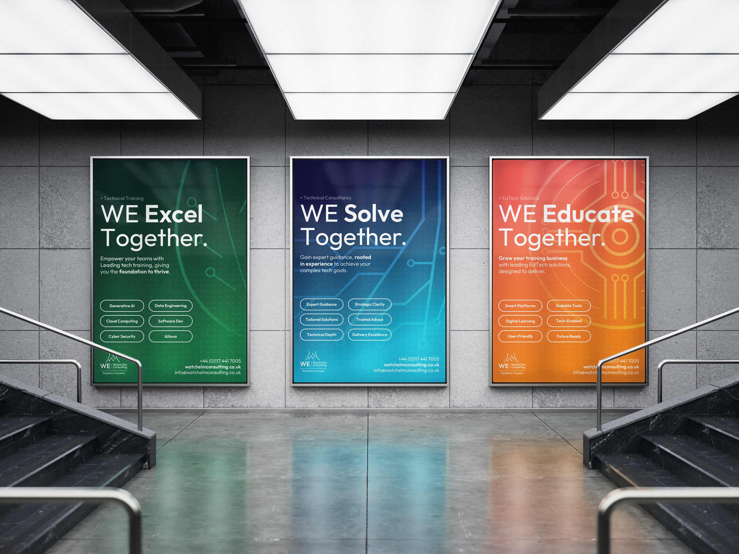
Concept B, “Rooted in Success,” drew inspiration from the elm tree that once stood in Bradley Stoke. Nature-derived colours gave each service stream its own identity, with an abstract circuit motif creating a juxtaposition between the modern technical world and something more enduring. Headlines: “Learn & Thrive,” “Achieve & Rise,” and “Innovate & Grow.”
Concept C, “Success Through Mastery,” took a corporate and structured approach aimed at large enterprise clients. A deep blue palette and direct call-and-response messaging communicated stability and authority. Headlines: “Enterprise Ready Training… Expertly Rolled Out,” “Technical Guidance Delivered… With Clarity and Purpose,” and “Digital Learning Tools… Developed by Trainers.”
concept b.
Concept B was the clear choice, with one refinement: Nick wanted the WE device from Concept A brought across. Watch Elm, shortened to WE, had real strength as both a logo mark and a brand statement in its own right.
With WE integrated into the identity, the concept gained an extra layer of meaning. The colours, the circuit motif, the growth-led messaging, and now a mark that spoke directly to the collaborative, partnership-driven way Watch Elm Consulting works. Everything pointed in the same direction.
From here the work moved into finalisation, refining the typography, tightening the messaging, and ensuring every element would perform at scale.
a message crafted for connection.
Each headline maps to one of Watch Elm Consulting’s three service streams, with the WE device acting as the connective thread across all three. The messaging was built to speak to different audiences while holding a single, coherent brand voice.
client testimonial.
“I came to the workshop knowing I needed help with branding, but what I got was so much more valuable. The process of defining our Mission, Vision, and Values wasn’t superficial, it forced me to articulate why Watch Elm exists beyond just delivering training. The ‘why are you different’ work was particularly powerful; it helped me see our unique position in the market and communicate it with confidence.”
Nick Todd
Director, Watch Elm Consulting
see more brand projects.
book your free consultation today.
or use our contact form to get in touch today